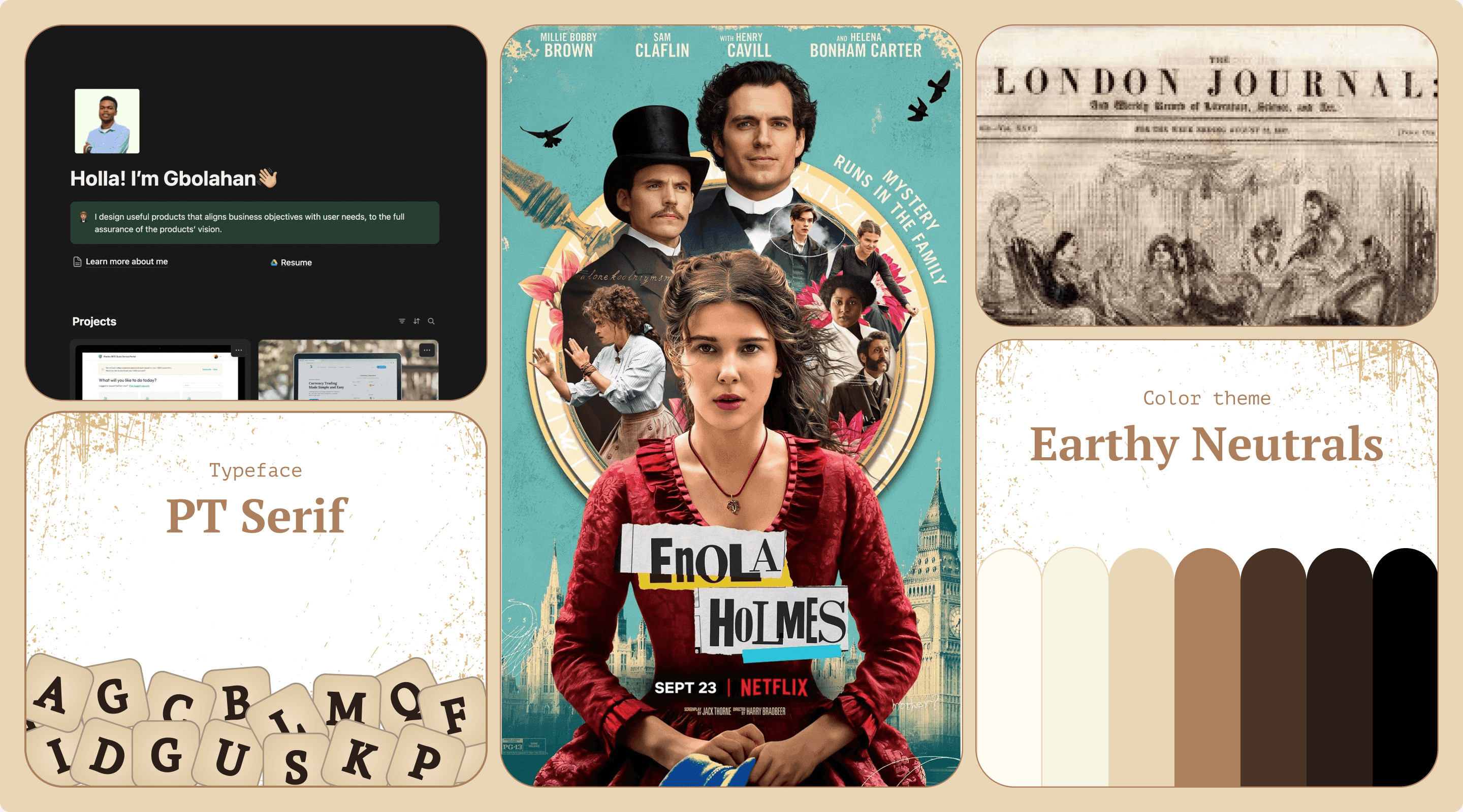
Where To Begin?
In a world where everyone follows trends and most websites, despite looking really beautiful and cool, feel the same, how might I design a portfolio that maintains the fundamental requirements but still stands out?
Existing portfolio
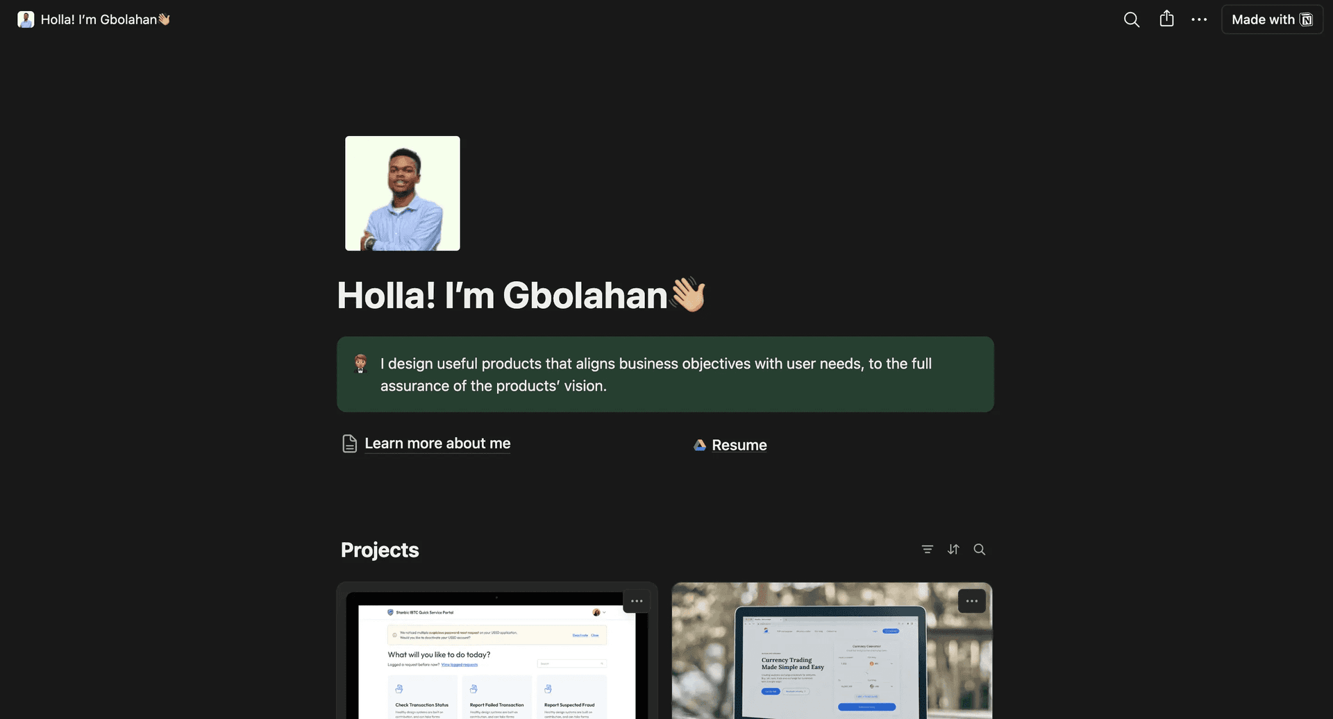
This portfolio subconsciously screams ‘low effort’ and feels generic. This does not really express who I am. I need to visually articulate ‘Gbolahan’ through my portfolio.
It All Began With One Question
Hmm, but who am I? What are my values? How can I translate these values into a visual language? If you ask me, I’d sum my values up to these:
- Curiosity
- Strive for excellence
- Attention to detail
- Being an outlier
But that would be too subjective. So, I set out to ask the one who knows me the best—my sister!
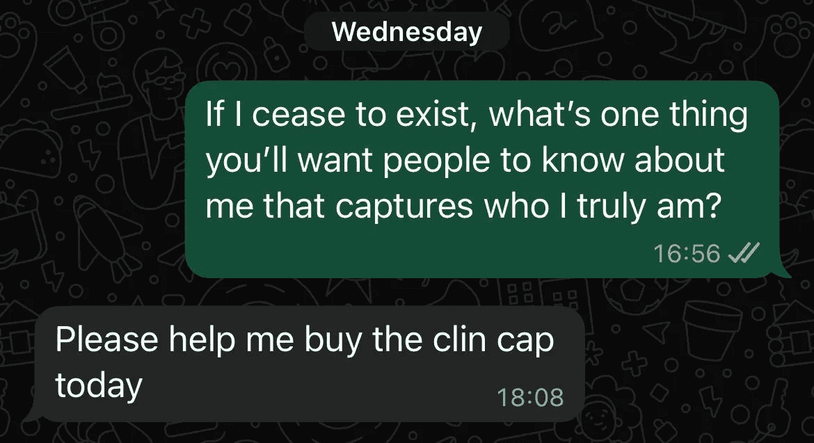
Yeahhh, I Was Aired. :(
But that’s not the end. The end? Pfft!
I went on to ask my closest friend the exact question.
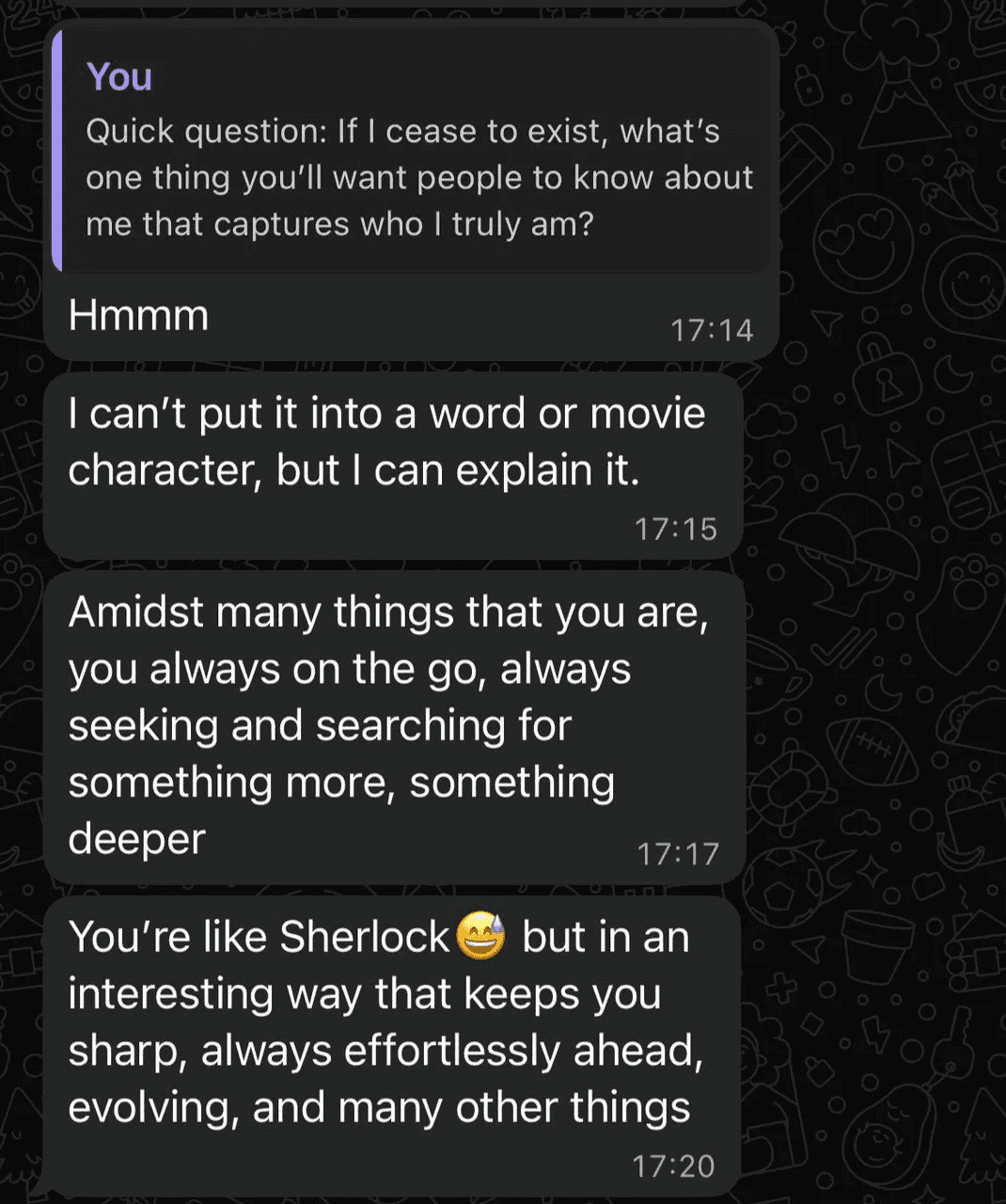
Now, We Are Talking :)
I particularly found that character reference, ‘Sherlock’, very interesting. Don’t say ‘you’re just gonna go with that?’ Well, I have thought of several things prior. From using a design tool interface to OS interfaces, to sleek modern designs, to Neobrutalism, to exploring how to express the visuals using action movie components [I love action and crime movies a lot]. Now, the last two might be too much; the others are no longer as unique. From my research, I found that very few people have adopted the use of pre-20th-century elements.
Plus, it sounds fun to work with. An exciting, creative adventure.
Sherlock Holmes is not exactly my type of person. I mean, I don’t smoke. I’m not a sociopath, but we seem to have some common traits, like curiosity, attention to detail, always searching for something more, and being excited about a new challenge. Hence, I’ll try to create a portfolio that exhibits these qualities, expressing them in his world. Sounds like a challenge!
Let's Get Serious
Sherlock Holmes lived and worked in the late 19th to early 20th century, specifically from the 1880s to the 1910s. This period was marked by intellectual curiosity, scientific progress, and methodical reasoning. Talk about foggy streets, gas lamps, horse-drawn carriages, telegraphs, early typewriters, and the first hints of modern forensics.
But this is not enough, I need to go back in time. I need to feel it. What other way is there to do this than to watch and rewatch the movie(s)?
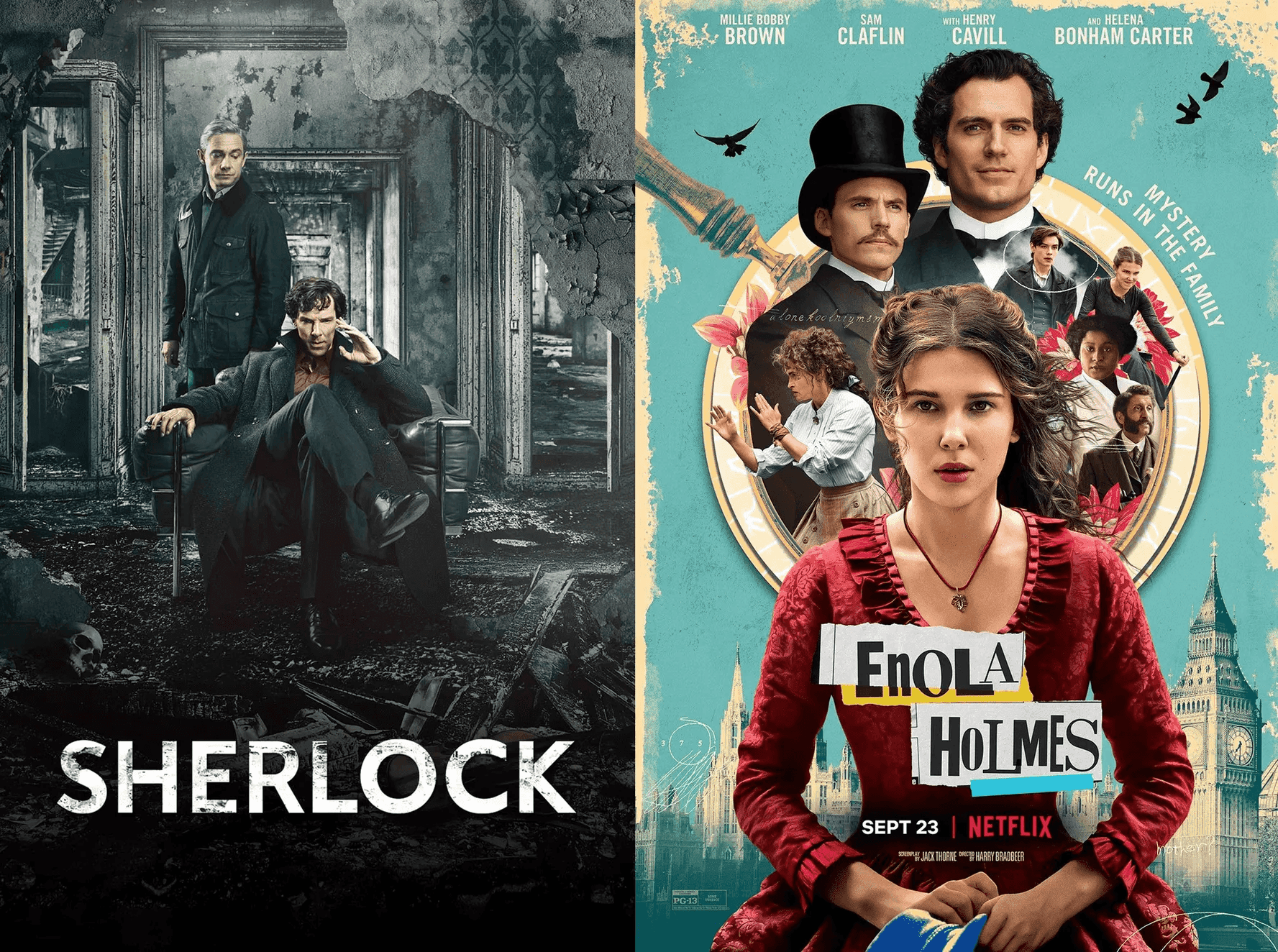
Notes
I wasn’t just having fun watching the movies; I was also being a detective. Word play huh? Maybe not, let’s pretend that didn’t just happen.
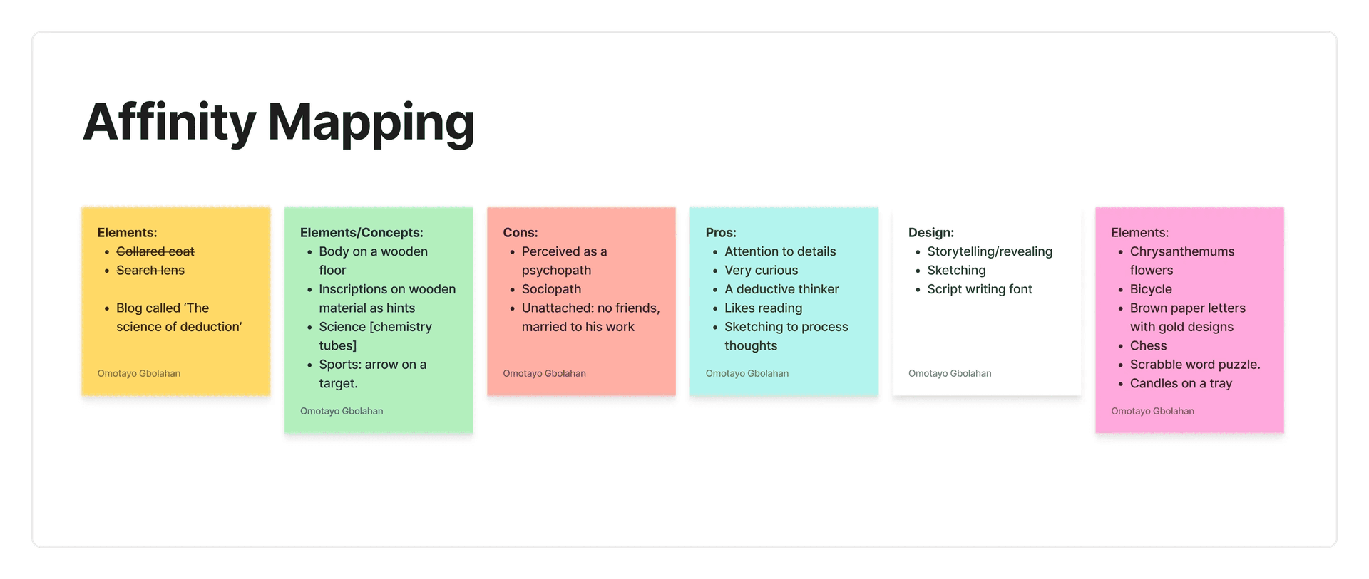
Translating Findings Into Visuals
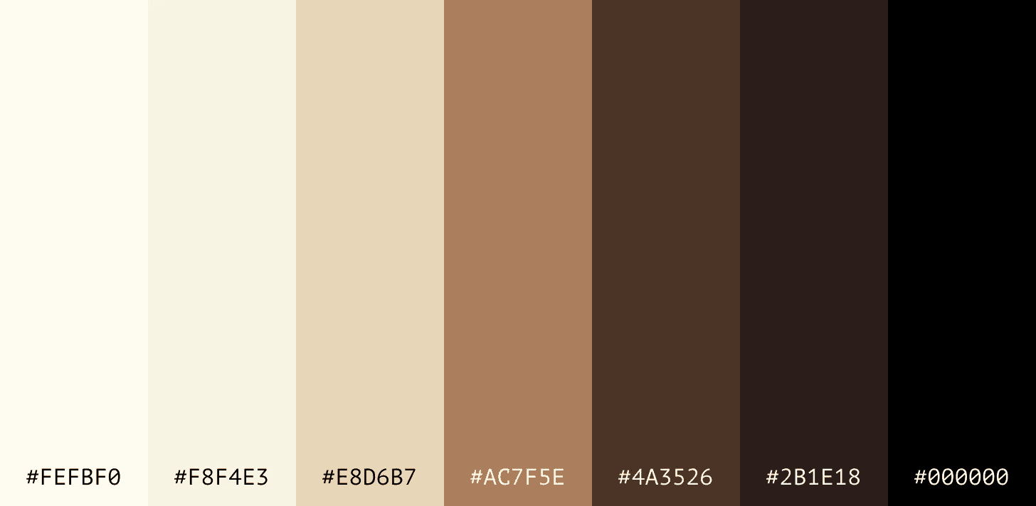
Colors
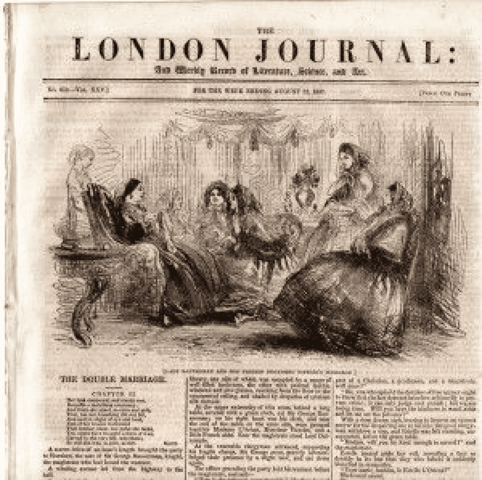
It is no doubt that the use of muted colors is not uncommon in the Victorian era, from the newspapers, to the letters, to the dresses, etc.
Typography
Need I scream ‘Serif!’? Well, not at first. I used Tusker Grotesk initially. Why? Cos I love Grotesk fonts. But sometimes, creativity is not allowing your emotions bleed out of a defined scope. Or not.
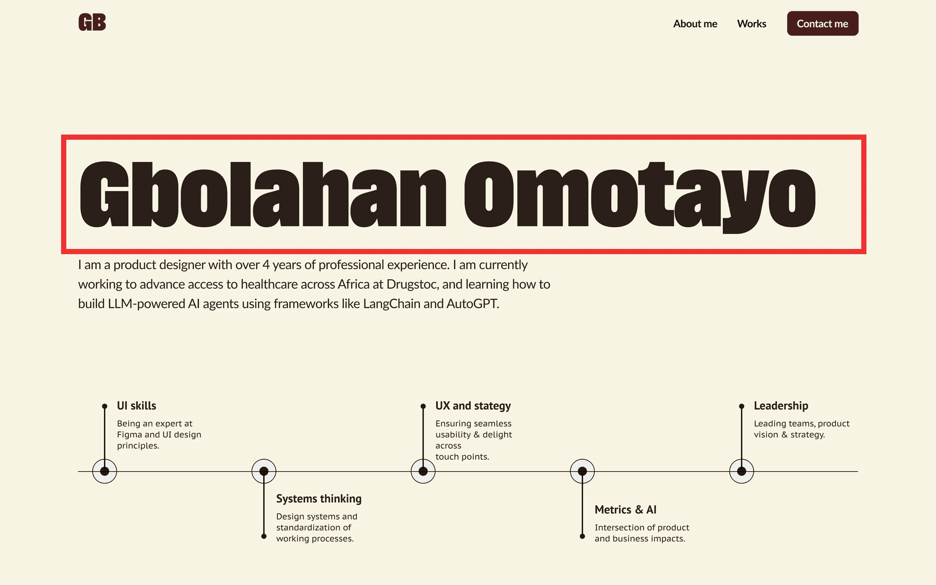
You know what? I watched Brian Chesky of Airbnb define Creativity as the ability to bring in experiences and elements from different spheres of life to make something. Very true. But for this use case, using sans-serif seems like peanut buttering, hinged on how I feel. I hope you get the distinction I’m trying to paint here.
Emotion is a beautiful part of the creative process, which sometimes, inevitably creeps in, but a brand designer or a design systems designer would ensure their emotional expression fits the tone and feel they’ve set out from the onset. You get me?
Fun fact: I explored Serif fonts to replace the sans serif, when typing this, and I discovered PT family/Serif. It’s gorgeousss! It looks almost exactly like the typeface used in the production of Enola Holmes, the movie.
Website Sections
Hero Section
This might be hard to believe, but I was literally in the bathroom, bathing, when the idea to use Scrabble letter tiles came to mind. I exclaimed! Too good to be true.
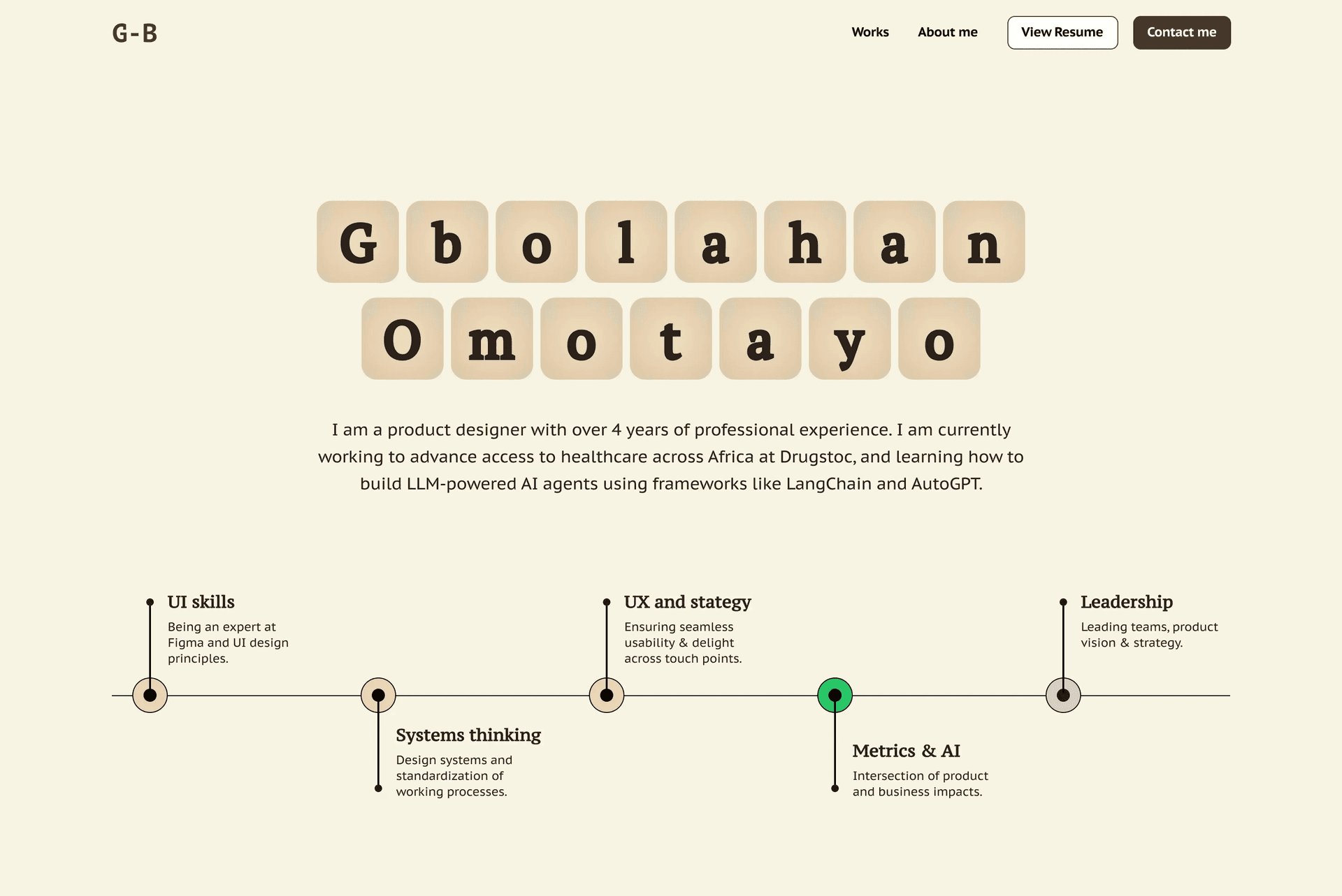
Fun fact about me: I love very simple designs. Sometimes, this means a lot of whitespace, which helps amplify the key information on screens. Asides a neo-brutalism website I worked on earlier this year, this portfolio will be my second most expressive design.
For the timeline, I have always wanted to add that to give recruiters a sense of where I’m at, where I’ve been, and where I’m headed.
That being said, I showed my sister to get her impression on it. ‘It’s nice but may be too bland. It feels as though there’s more to it that’s yet to be implemented, or a hover interaction on the letters that’s yet to be implemented.’
Then I remembered a friend’s ancient-themed birthday post I saw on WhatsApp. He used the grunge effect, and it came out really nice. ‘Let’s try that out, innit?’
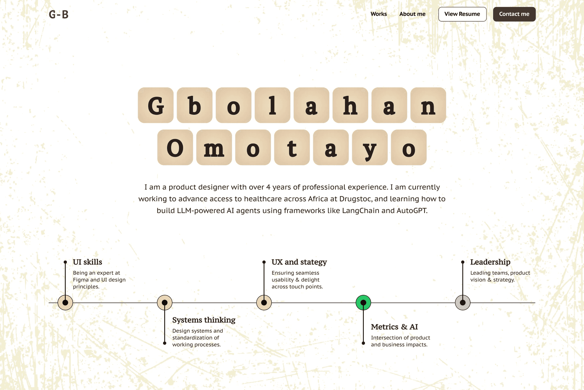
Cool coool coooool. Looking more like the vision. Feedback is priceless.
Case Studies
Quite easy to connect the dots here. I thought to use ‘case files’ since I’m a ‘product detective’. agrh! Saw that word play? No? Okay, I’ll stop. I imagined having case 1, case 2, etc. with statuses like solved, in progress, sheeeesh!
Visually, I explored using folders to represent the case files, and then I set out to create one, with the intention that when the cursor hovers on each, it slides open to reveal the case data. The intended layout will be 2 case files per row.
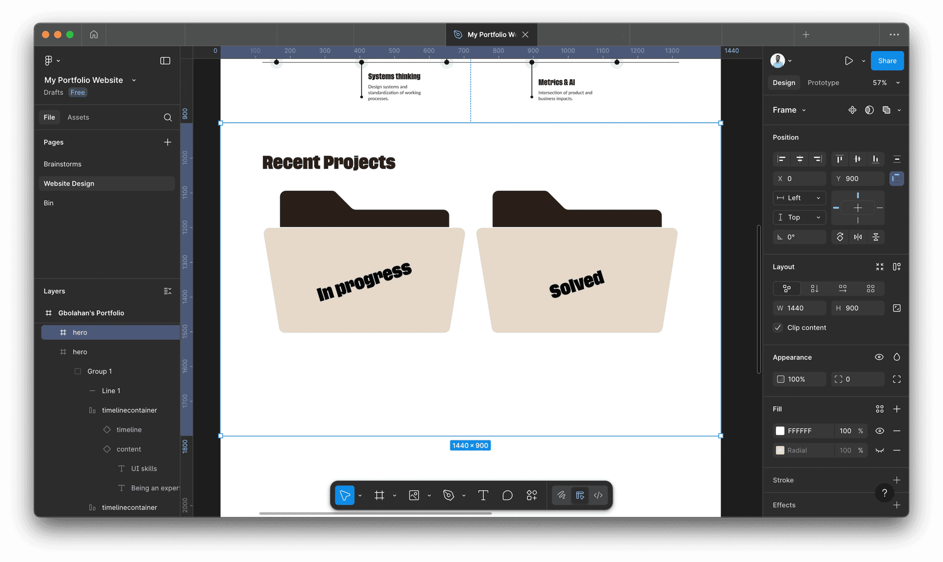
However, I discovered that this approach might be chaotic and negatively impact the user’s experience. Having the details concealed until hovered on, is a no-no. Also, imagine moving your cursor from top to bottom, the multiple animations on the different cards may be too much. Distracting even.
So I set out to explore other styles. This time, very Victorian era-ish.
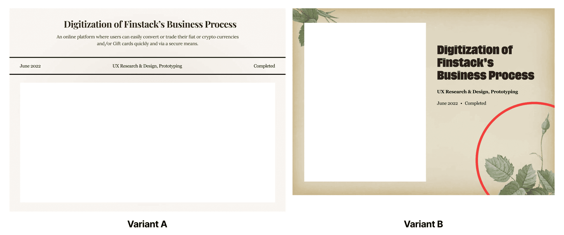
Uhmmm.. this fits the description I had in my head, but it was at this point I realized I don’t want to go all into the typical Victorian era style. Maybe let’s find a balance, yeah? What we have is no fun. By the way, the red-circled part is supposed to represent Chrysanthemum.
So, I went with my MO: simplicity always wins.
Secondary Works
On we go, to other projects.
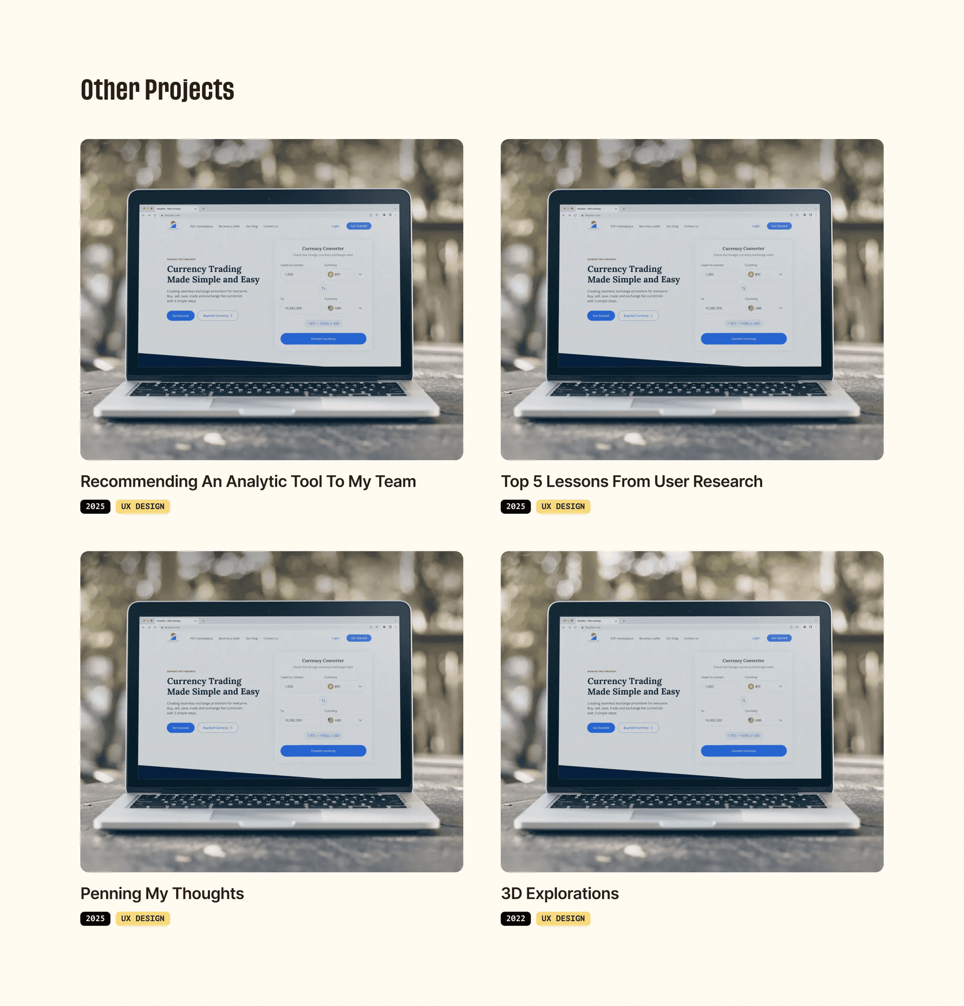
The layout adopted above seems too conventional, so I immediately set out to create something more interesting, using a chessboard-like layout.
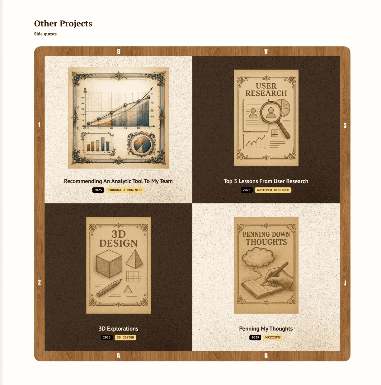
Here, the wooden sections are rectangles filled with a Pinterest wooden image. The chess boxes have a screen/multiply grunge effect, which gives it a noisy feel. The hand-drawn images were generated by OpenAI’s ChatGPT.
Footer
I wasn’t really sure if I should create a separate page for ‘About me’ or to keep it on the page. After much deliberation and website scouting on Cofolios, I decided to keep it on the page for ease of access. I then thought to use carousels to present it in a multi-modal storytelling approach, and reduce the scroll length of the page.
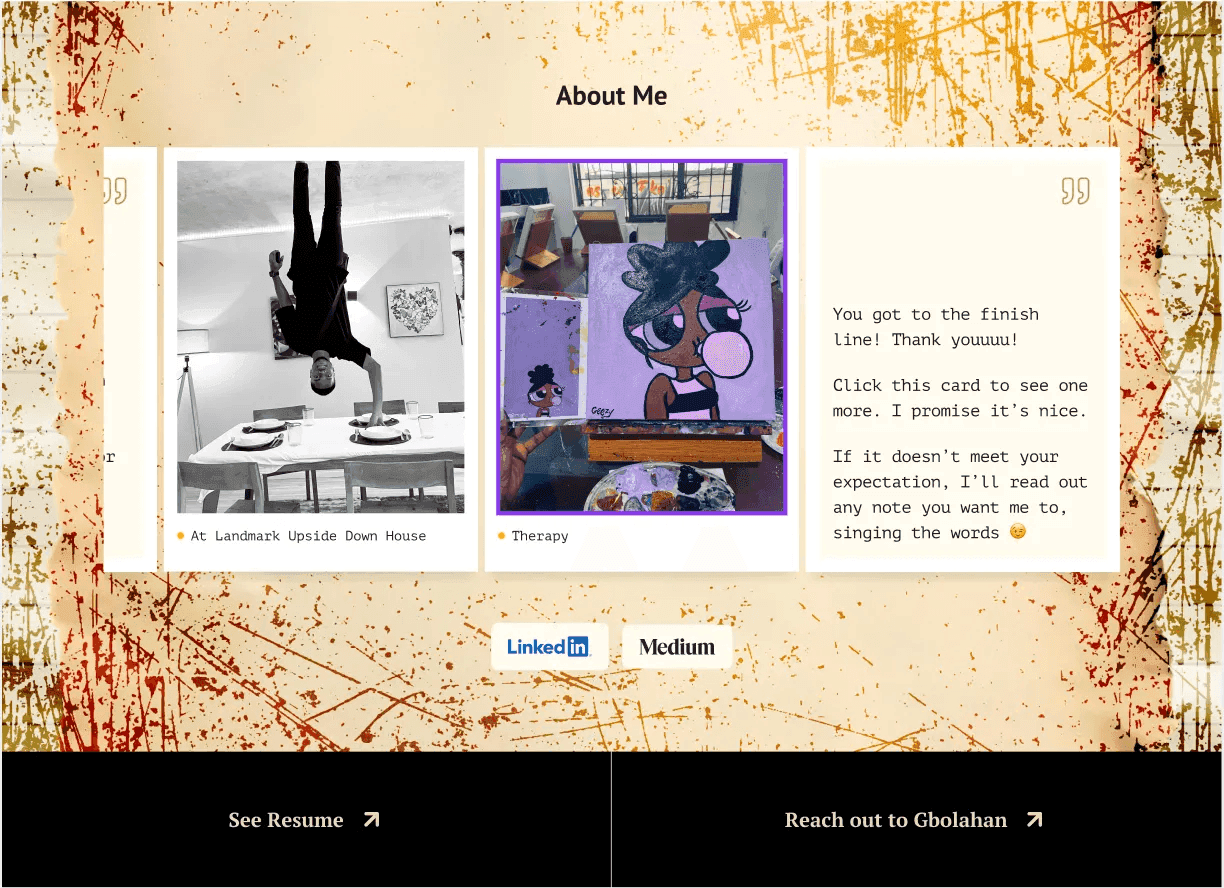
The background of the section was made up by playing around with these elements:
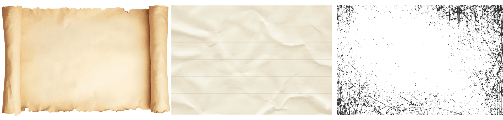
.. and in a quest to prioritize user experience regardless of the creative direction, I added primary calls to action at the end of the page.
What Do You Think The Next Step Was?
Take a guess…
Yeah, showed my sister again to get a fresh perspective on the design. Her feedback made me realize that the hero section, the ‘other projects’ section, and the footer had an intentional twist to them, but the case studies section looked like an orphan in the story.
Enola Holmes’s mother once said:
So this time, I went through a handful of global branding agencies’ websites, since they also show their project case studies on their website. Despite the many approaches seen, the different ratio, yet systemized layout stood out to me. I gave it a try:
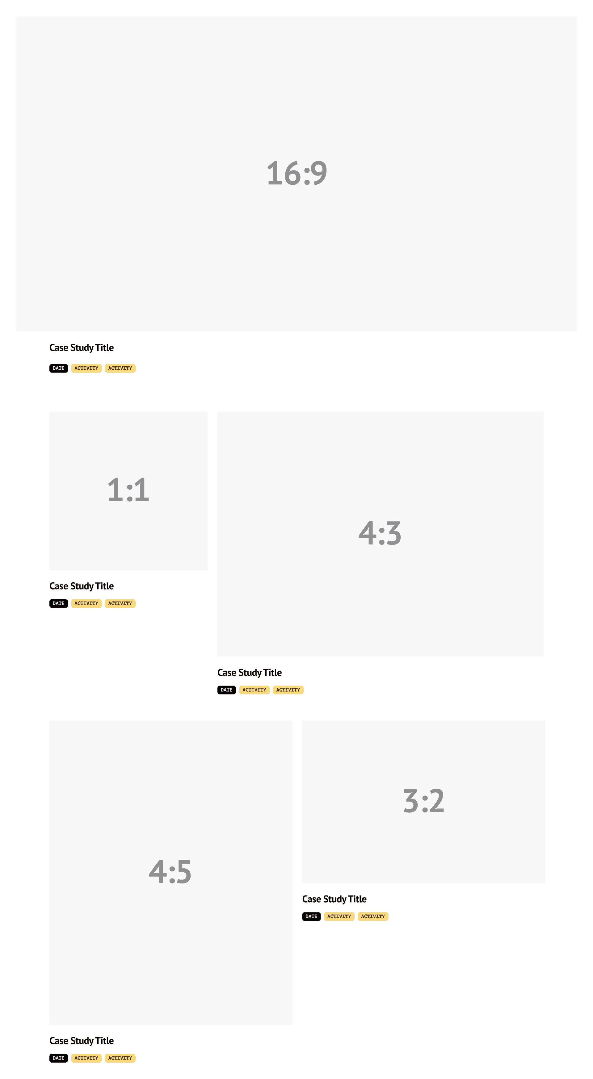
I love this! It not only looks unconventional but also reduces the scroll length/frame height by approximately 20%! Also, this aligns with how content is represented on a typical ‘newspaper’, with a flexibility in the width or height of the layout.
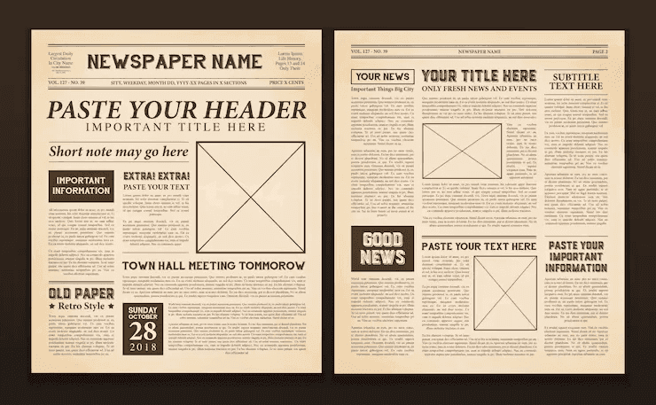
A Necessary Distraction
For the display images for the case studies, I created variants of screens and screen recorded, for some. For the most recent case studies, I spent over 5 hours cooking up something to be supposedly really cool. Have you ever worked on something so hard and long, but the final output doesn’t match the quality/standard you had painted in your head prior? Yeah, can feel messed up.
I had to take about a 2-hour break listening to music (my super healing power) and a couple of chores, for a factory reset, then I gave it another try. This time, I was clear on the direction NOT to go, and I was eventually more confident in the output. That’s what is on the page as we speakkk.
The End … But With A Little Worry
‘What will the mobile view look like?’. For example, how will the chess section respond to screen sizes? We might need to make some compromises on small screens, where the cards stack vertically.
Even More Worries
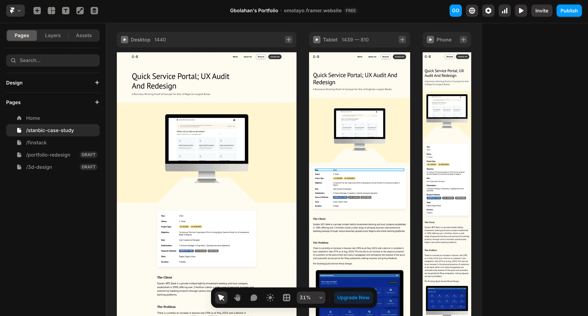
All of these aforementioned processes and buildings have been done on Figma, while the case studies are still embedded in Notion—which will always open as a new tab. This will be quite chaotic for a recruiter going through my portfolio.
Taking The Bull By The Horn
So I took the bold step to convert all to a live website.
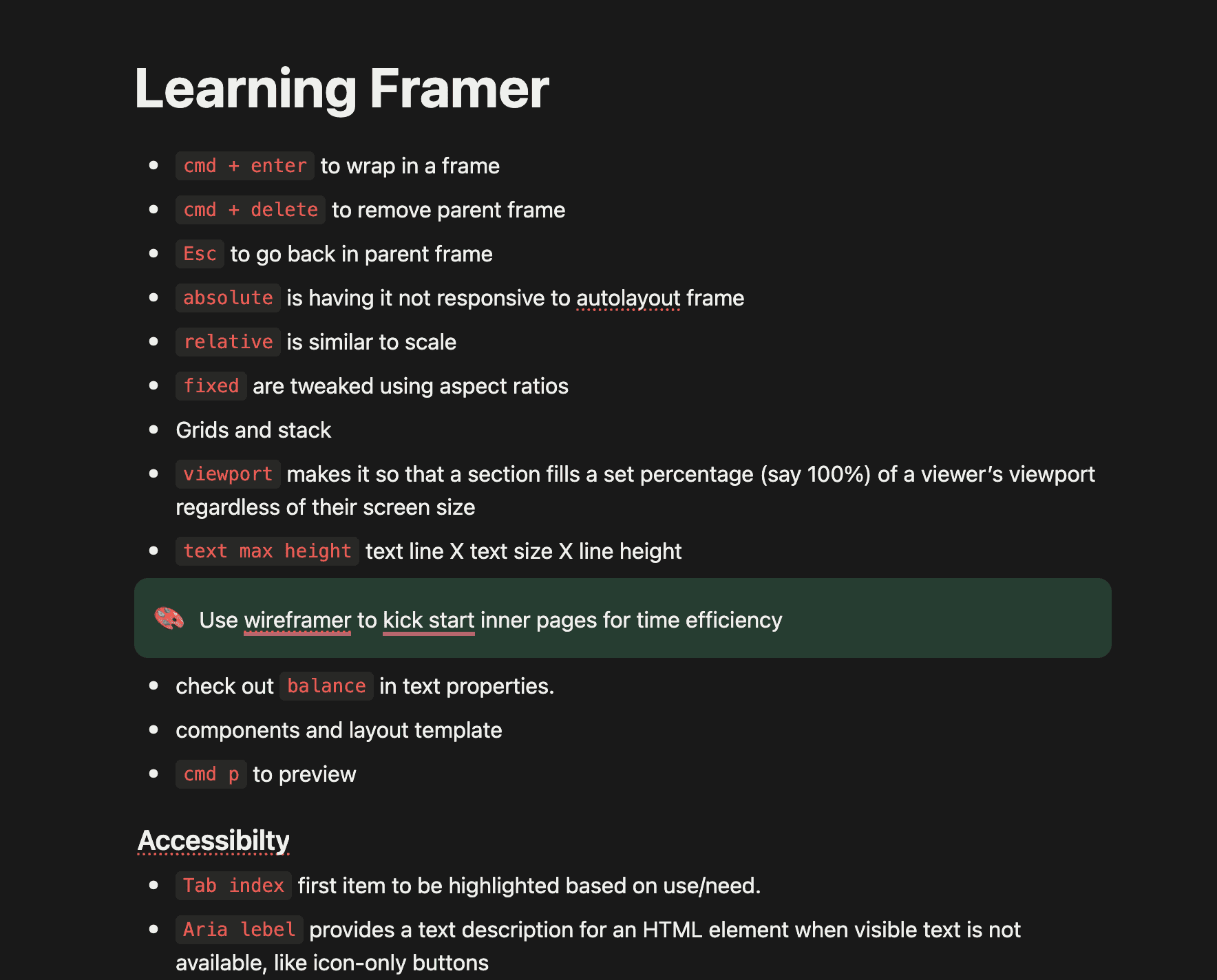
This will also include efforts to ensure the responsiveness of the website across tablet and mobile views. I opted for Framer, a no-code tool with little learning curve for someone who lives in Figma.
Lessons Learned
- Feedback has always been and will continue to be any creative's super power.
- The creative direction changed from being very strict to having the flexibility to find a middle ground between the Sherlock and modern feel. Maybe I shouldn't always be as strict with pre-defined rules when doing creative works.
Thank you for reading to the end! You’re a real MVP!