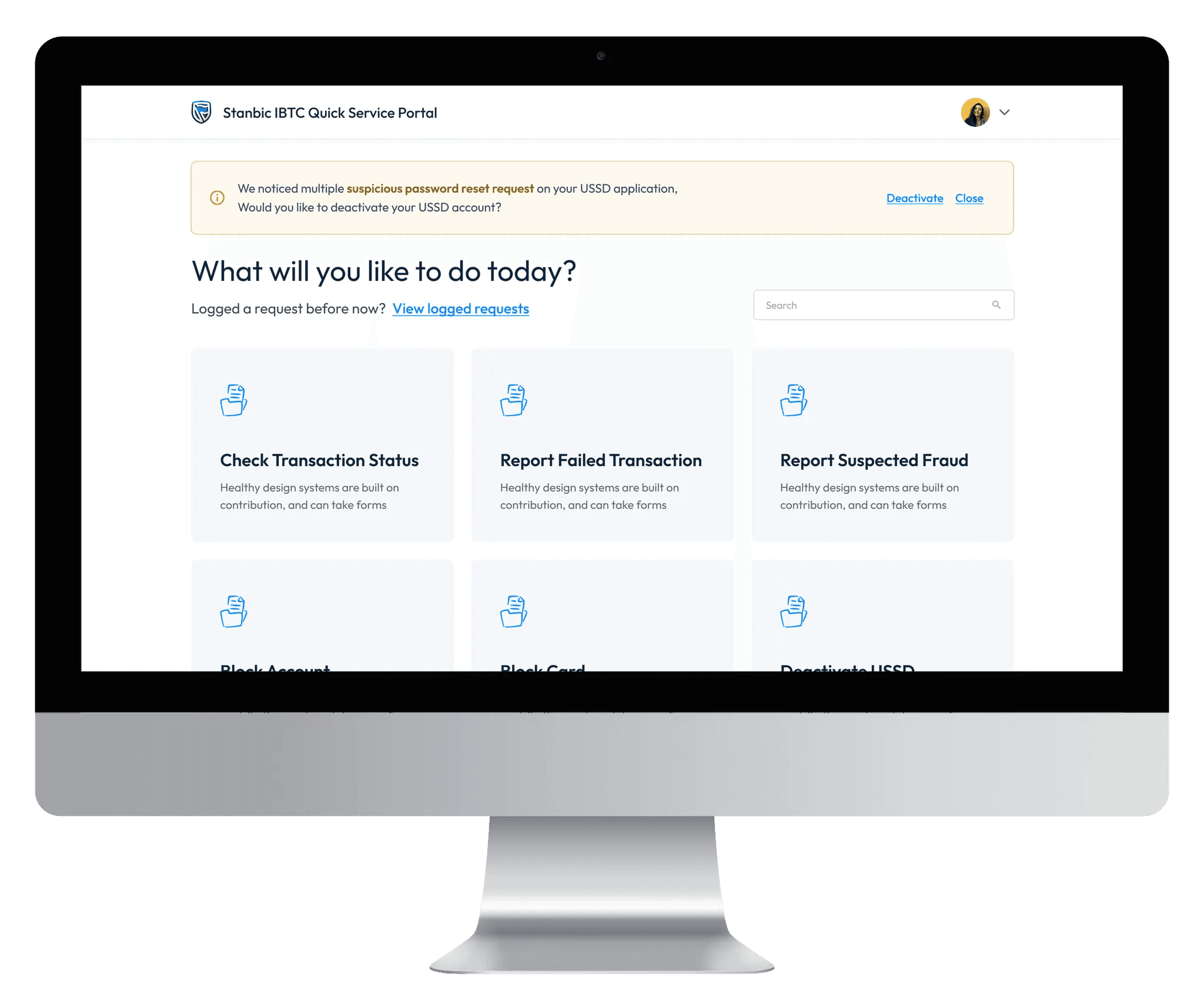
The Client
Stanbic IBTC Bank is a private limited liability Investment banking and trust company established in 1989, offering over 2.4million clients a wide range of personal, business and commercial banking products through various branches spread across Nigeria and online banking platforms.
The Problem
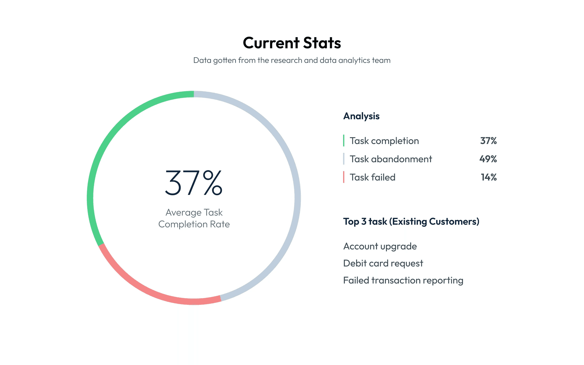
There is currently an increase in bounce rate (78% as at May, 2023) and a decline in customer’s task completion rate (37% as at Aug, 2023). This has led to an increase in the physical presence of customers at the bank which isn’t really manageable and contradicts the essence of the quick and accessible service portal for filing complaints, making requests and giving feedback.
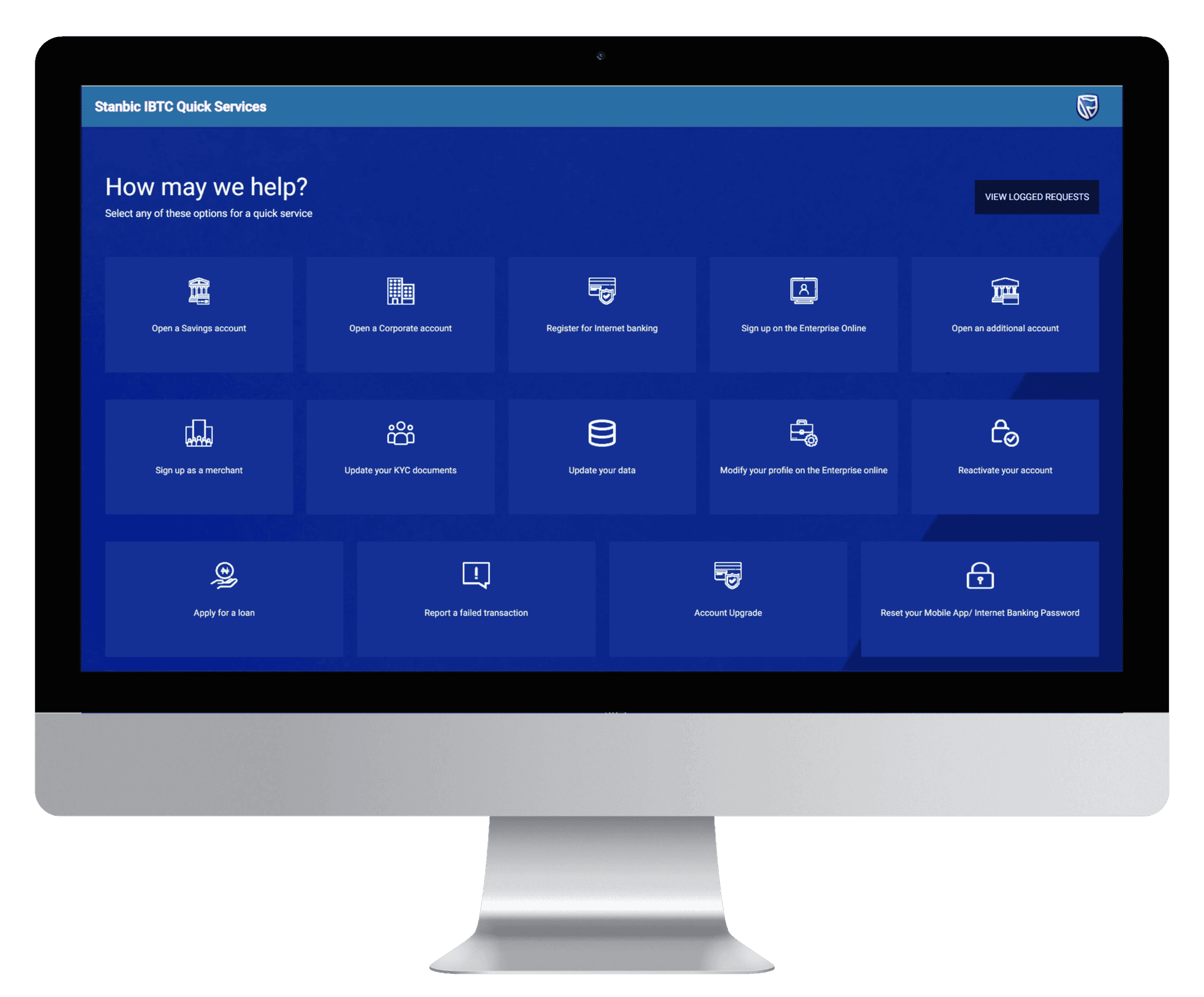
Pre-existing Quick Service Portal Design:
Defining The Scope
The bank organized a selective tendering, offering selected software technology companies an opportunity to pitch a workable and feasible solution to their business distress.
Design Process
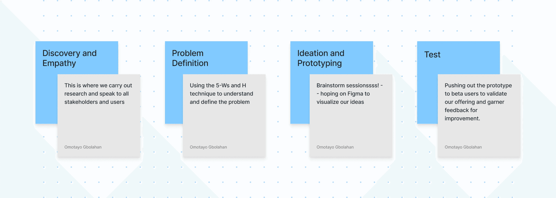
These are my watchwords when demystifying an experience issue or developing a product:
Research & Findings
A stratified sampling technique based on such characteristics as age group, education level, account tier amongst others, was used to draft a set of about 1000 beta users.
Adopting the 5Ws and H technique (Who, What, Where, When, Why and How)
User Interview
We organized interviews and focus group sessions with a good number of our customers and these are our deductions of the most persistent feedback:
- Users get overwhelmed with information overload as they land on the page
- The use of colors needs to be minimal considering the large user base of different characteristics (E.g Josephine)
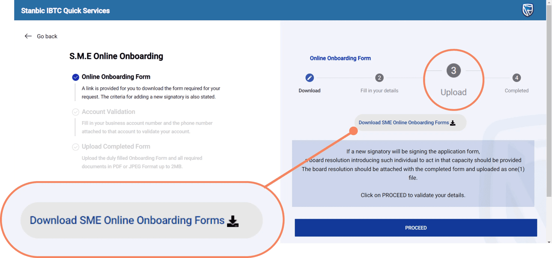
- The need to fully automate the process:
Automating the process
Following the image pasted above, most of the processes require users to download a form for each request, fill it manually and then re-upload to the portal. Not so efficient. We will be digitizing the whole process.
Problem Statement
“How Might We” Statements
- How might we automate the entire end-to-end flow of each task
- How might we find a way to reduce information overload on each view on the portal
- How might we consider the incorporation of accessibility enhancements
Ideation and Wireframing
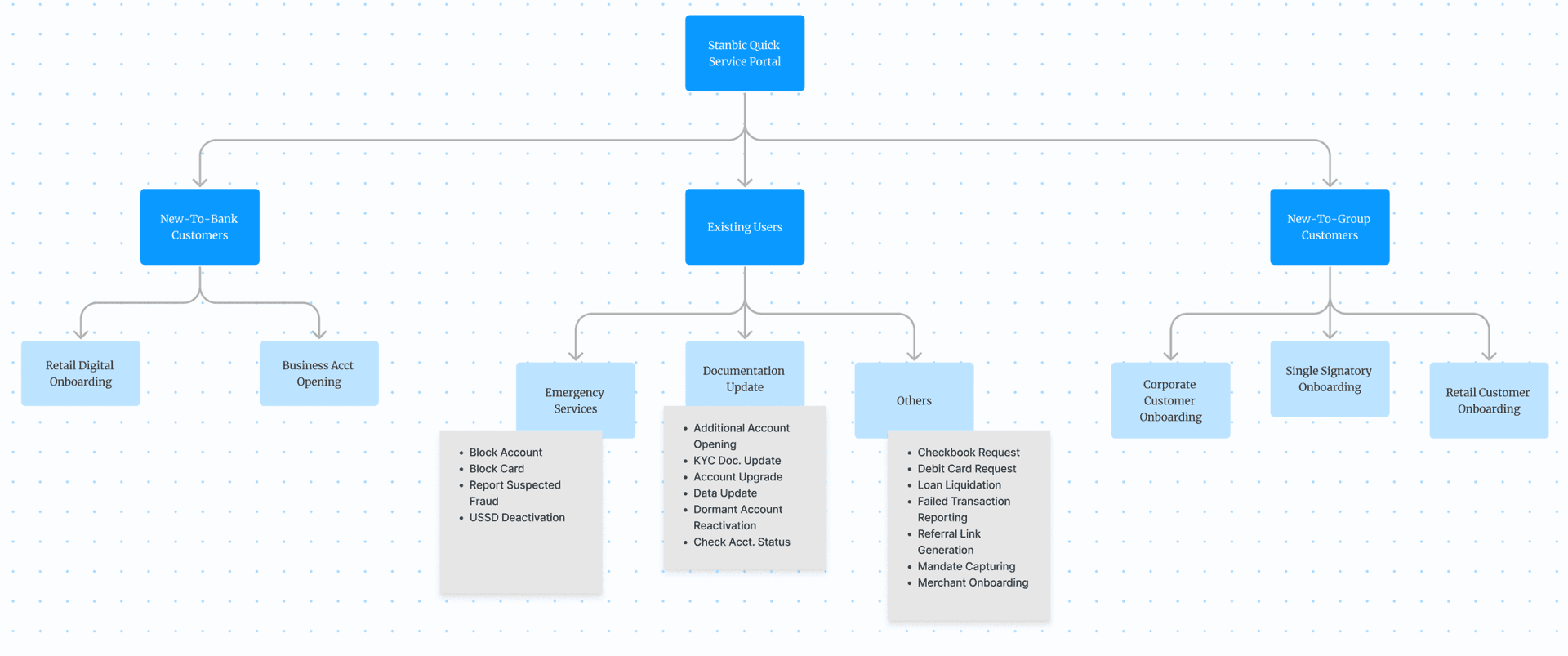
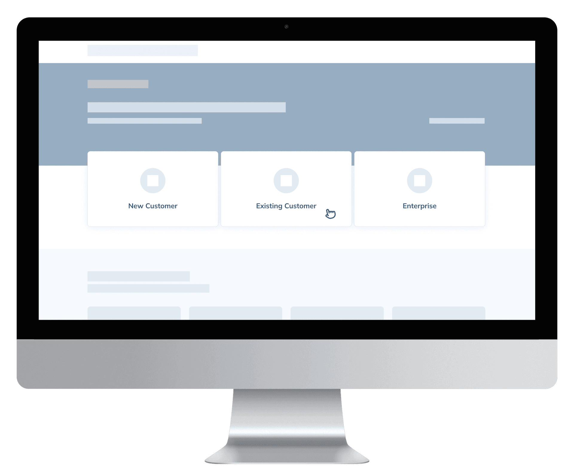
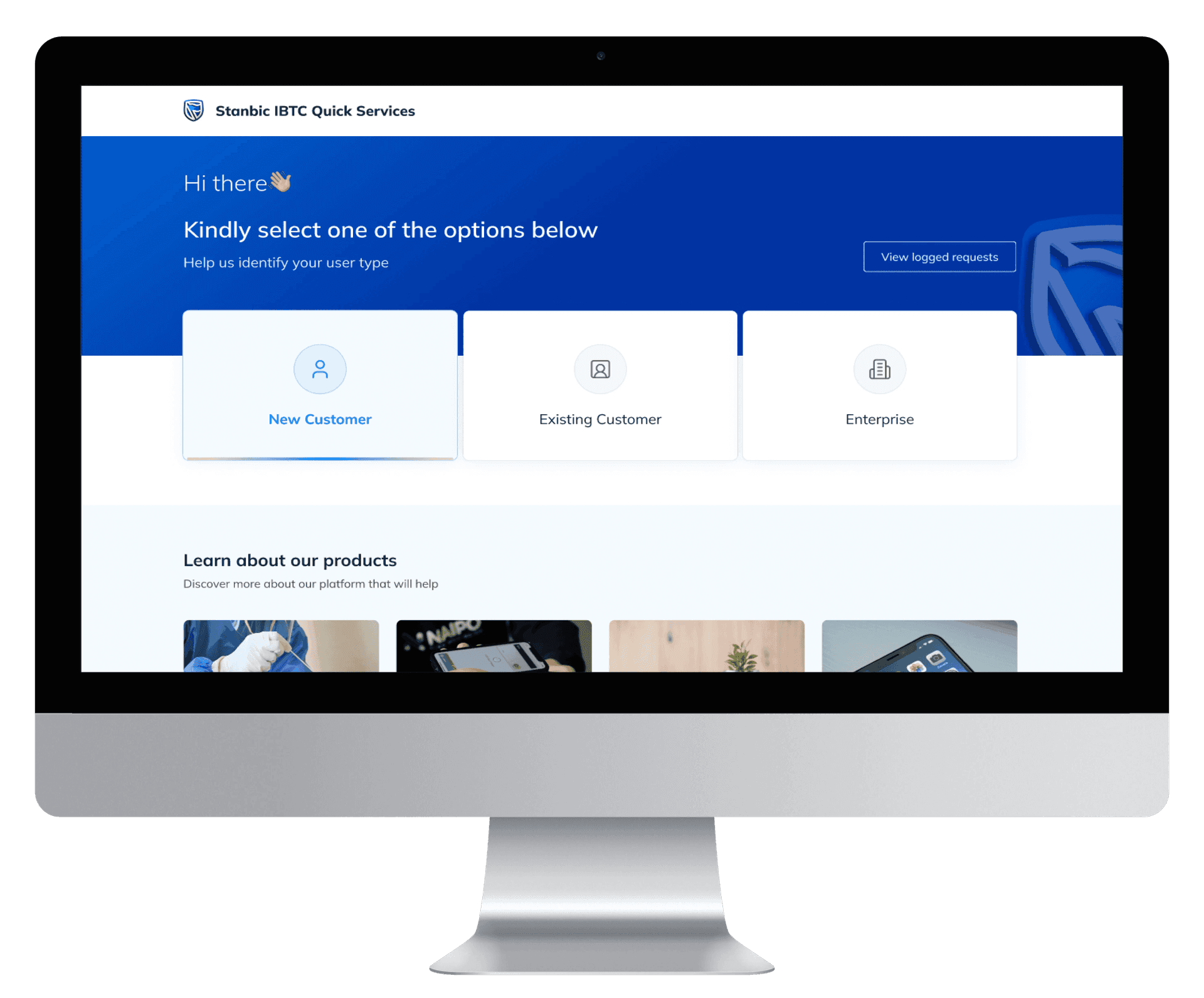
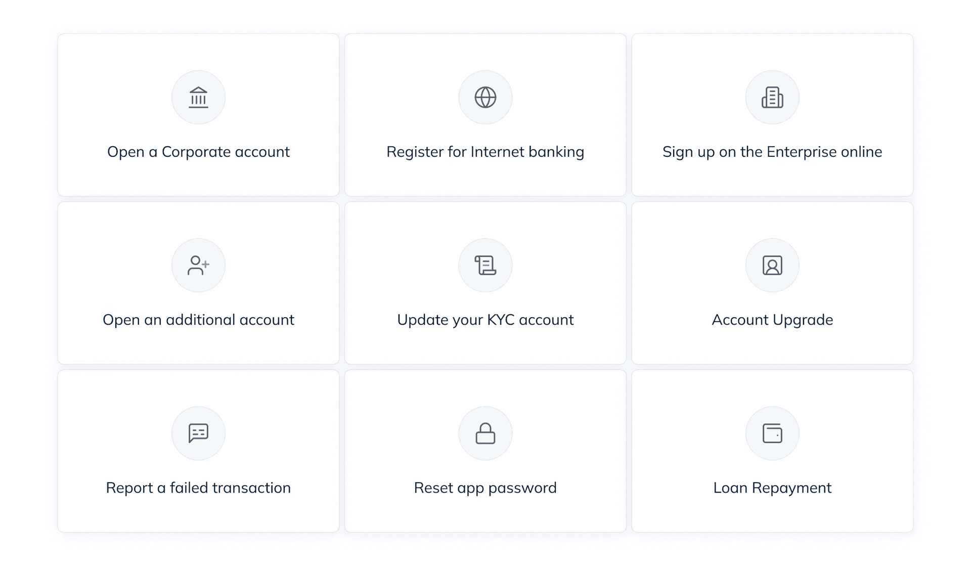
A new user need not see such options as ‘Upgrade’, ‘Dispense error report’ and many more. They haven’t even opened an account yet. Hence, we need a way for them to identify their user type to streamline the process and reduce the risk of being overwhelmed.
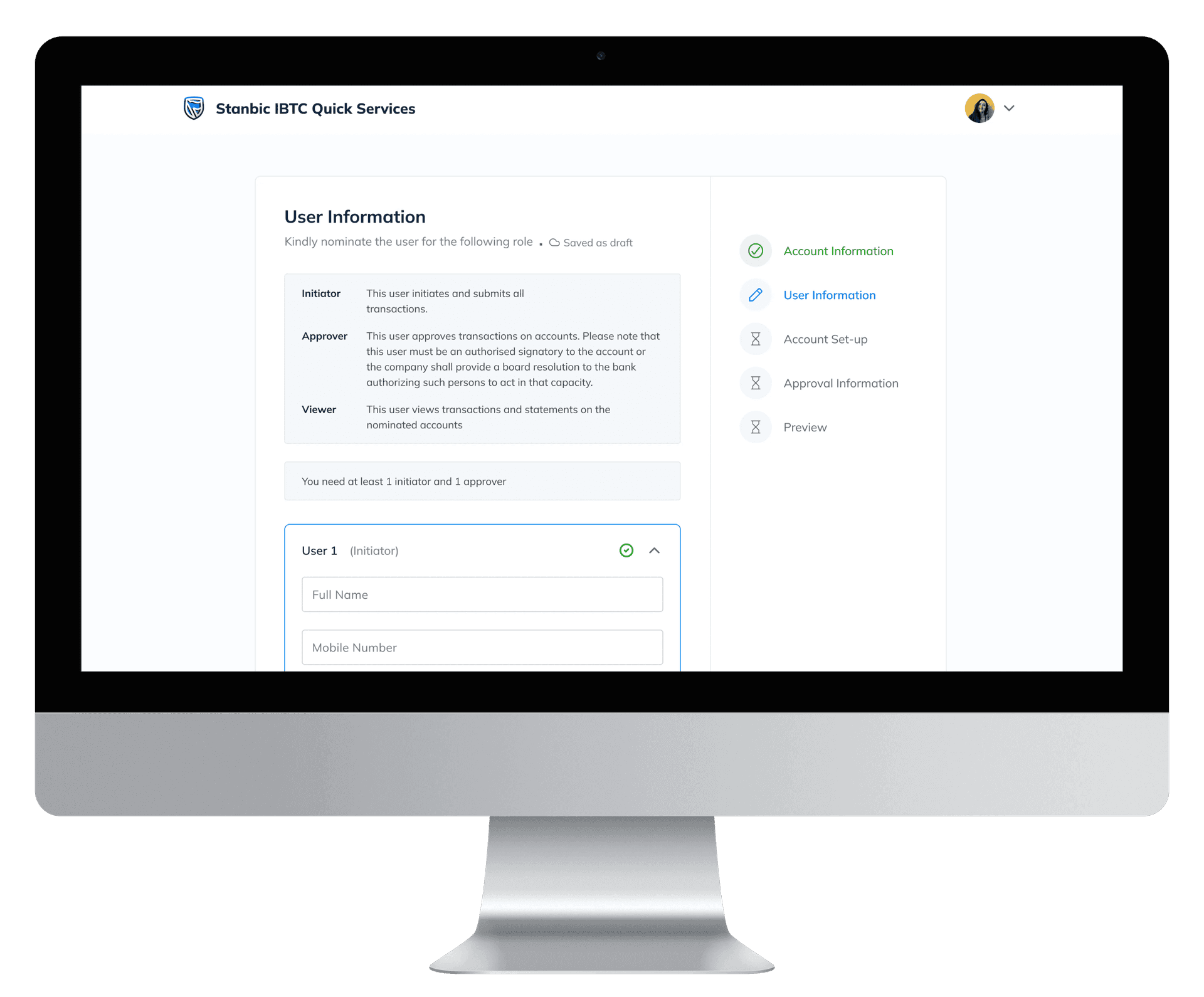
Whoo-hoo!
… that was what I thought, until feedback started rolling innnnn! :{ It was actually great as it helped improve the product. Stay with me :)
Feedback (Stakeholders & Beta Users)
- Stakeholders: We ought to have used any of the popular requests as the proof of concept e.g Acct upgrade, Debit card request etc.
- The hero section shouldn't show a glimpse of the blog section. It's of less priority and increases the amount of time spent on the page as users try to make sense of all that's on the screen.
- There's still a lot of colors on the page. and the gradient hover effect isn't pleasant to most users.
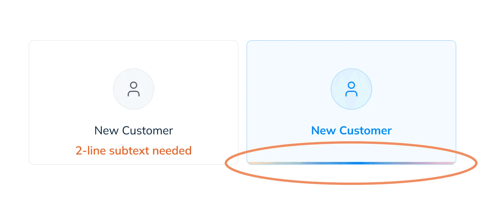
A subtext will be required to give users context to what each card does. Not all title are self explanatory.
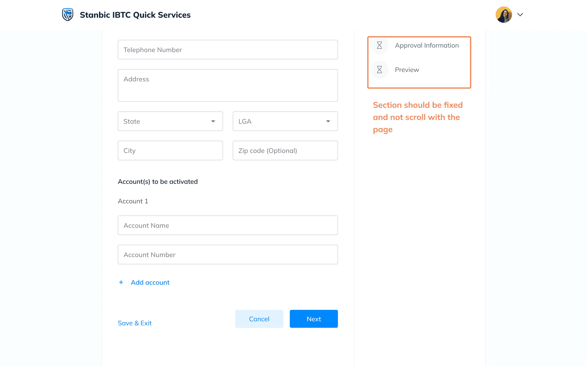
Progress tracker ought not be in the card and not scroll together with the whole page content. Users shouldn’t have to scroll to know where they are in the process.
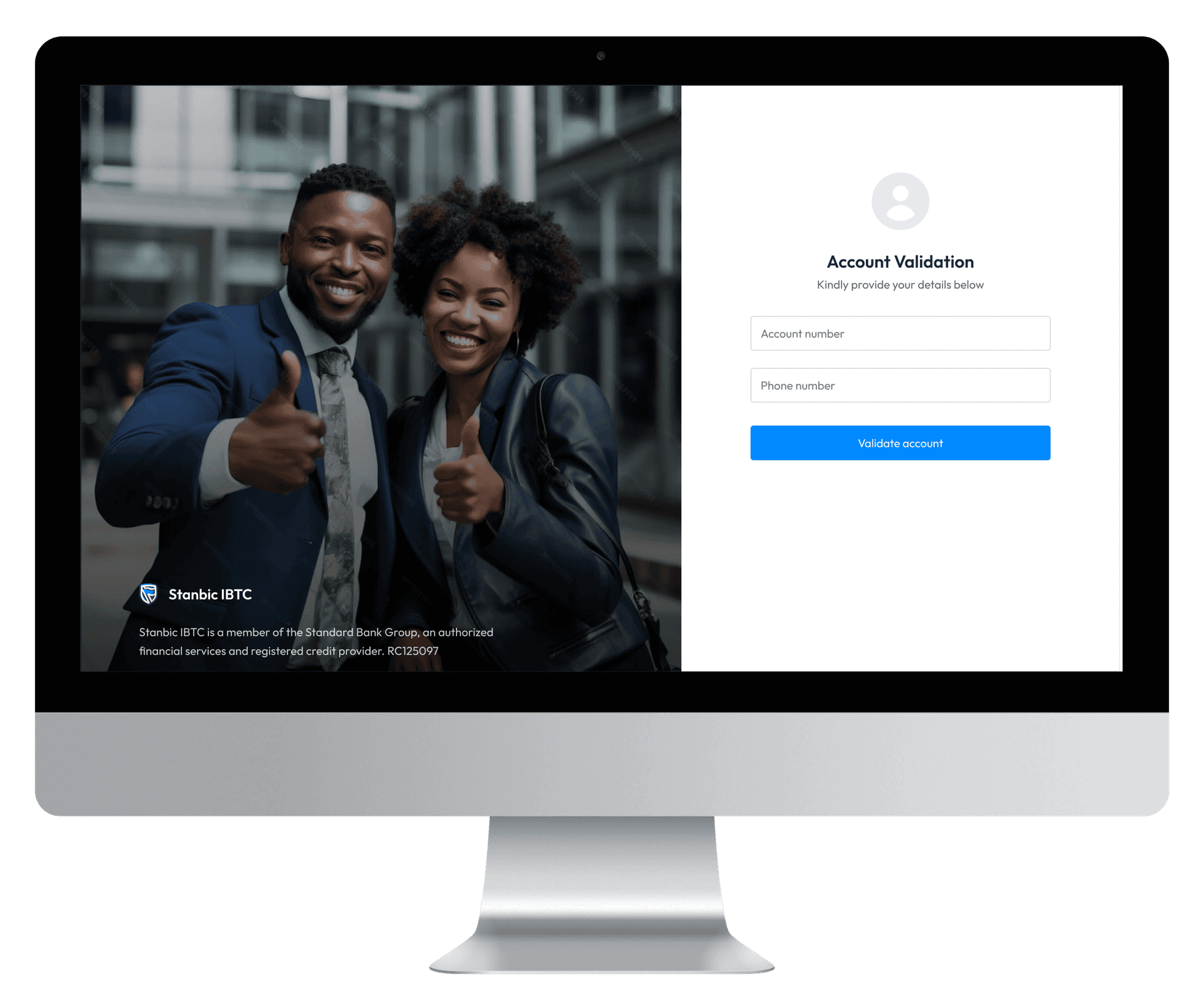
Authentication screens aren’t user friendly. We should add some human touch.
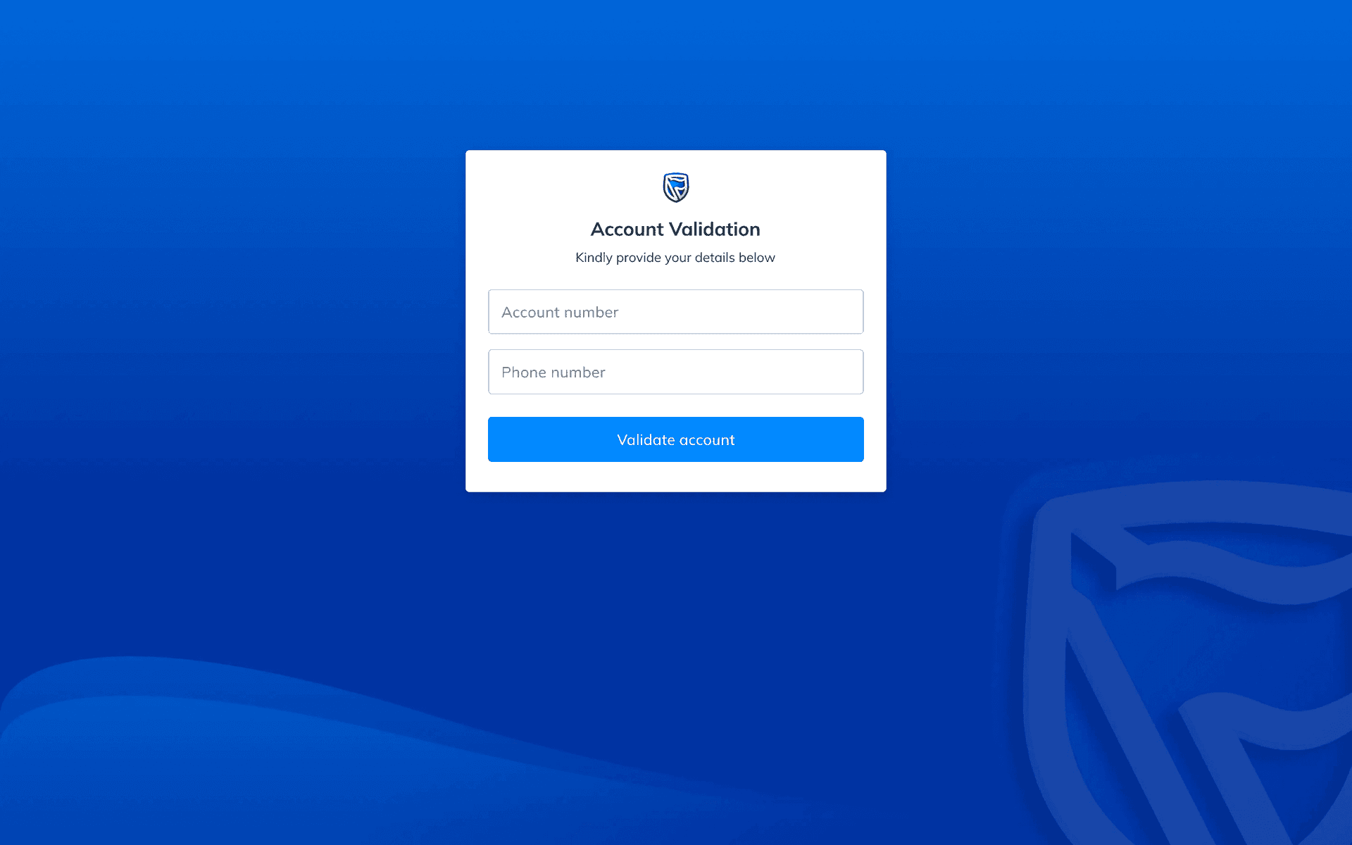
Phew! We go again!

I am the one smiling for reasons I can’t remember. Safe to say we found a way out of something :)
Second iteration
Request Cards (Accessibility in consideration)
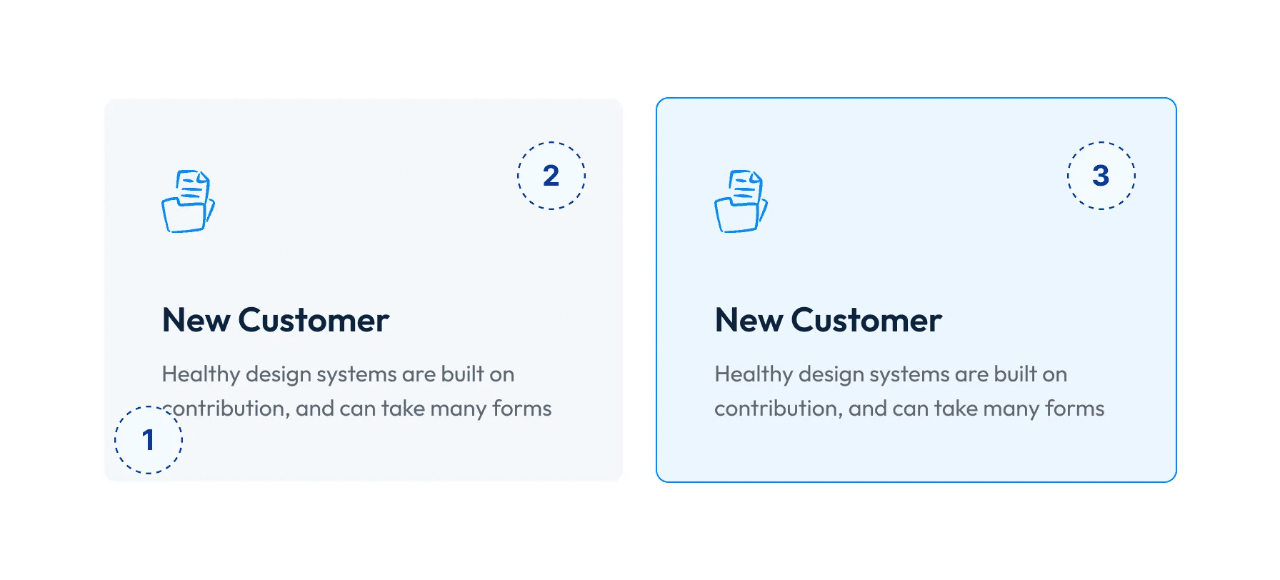
- Subtext to aid better understanding of each request type
- In a quest to have a minimalist and universally accepted design, I opted for a grey background color
- … and a subtle shade of the primary color for hover indicator
Landing page - Hero section
Now, we have a simpler, cleaner and clearer design all contained in a view aimed at ensuring there isn’t any break in achieving their goal. Users can then choose to scroll down to see the blog section at their discretion.
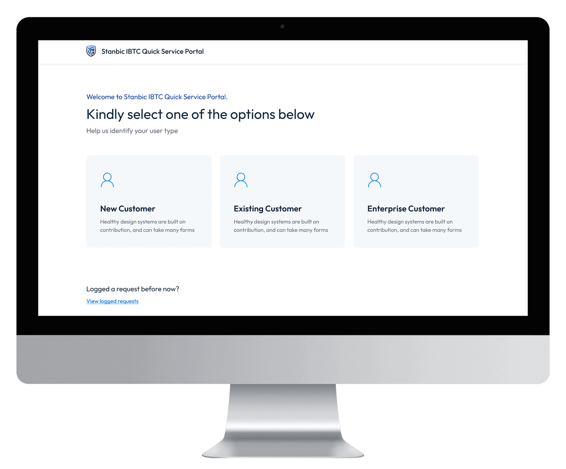
User friendly Authentication Screens
Application Screens
Progress trackers are now fixed while other components scrolls
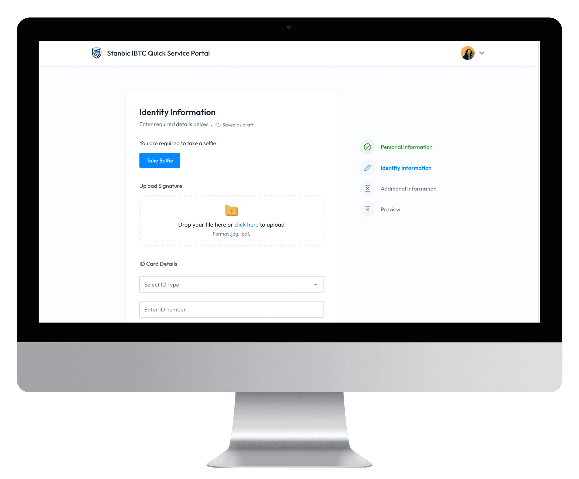
Designing Delightful Experience
Homepage
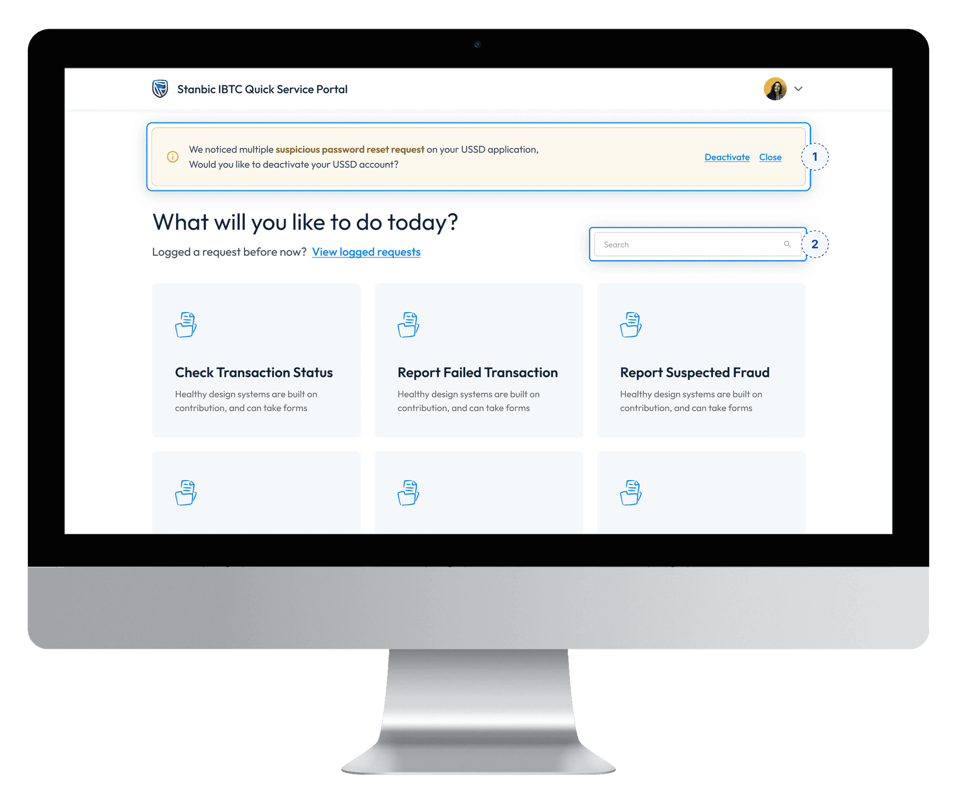
For security reasons, when a user login, we inform them of recent suspicious activities on their account and call to actions to take a step, either to report, stop the action or ignore the notice.
For easy findability, we added a search mechanism that works as an ajax search, sorting the page with card having title similar to the inputted query
Initiating an account upgrade process
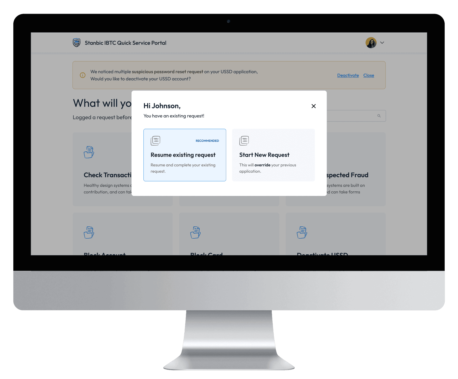
We are aware that the documentations needed to upgrade one’s account may not be available at the time of application, hence, we catered for such use case where user can login to resume an existing application.
Debit card check
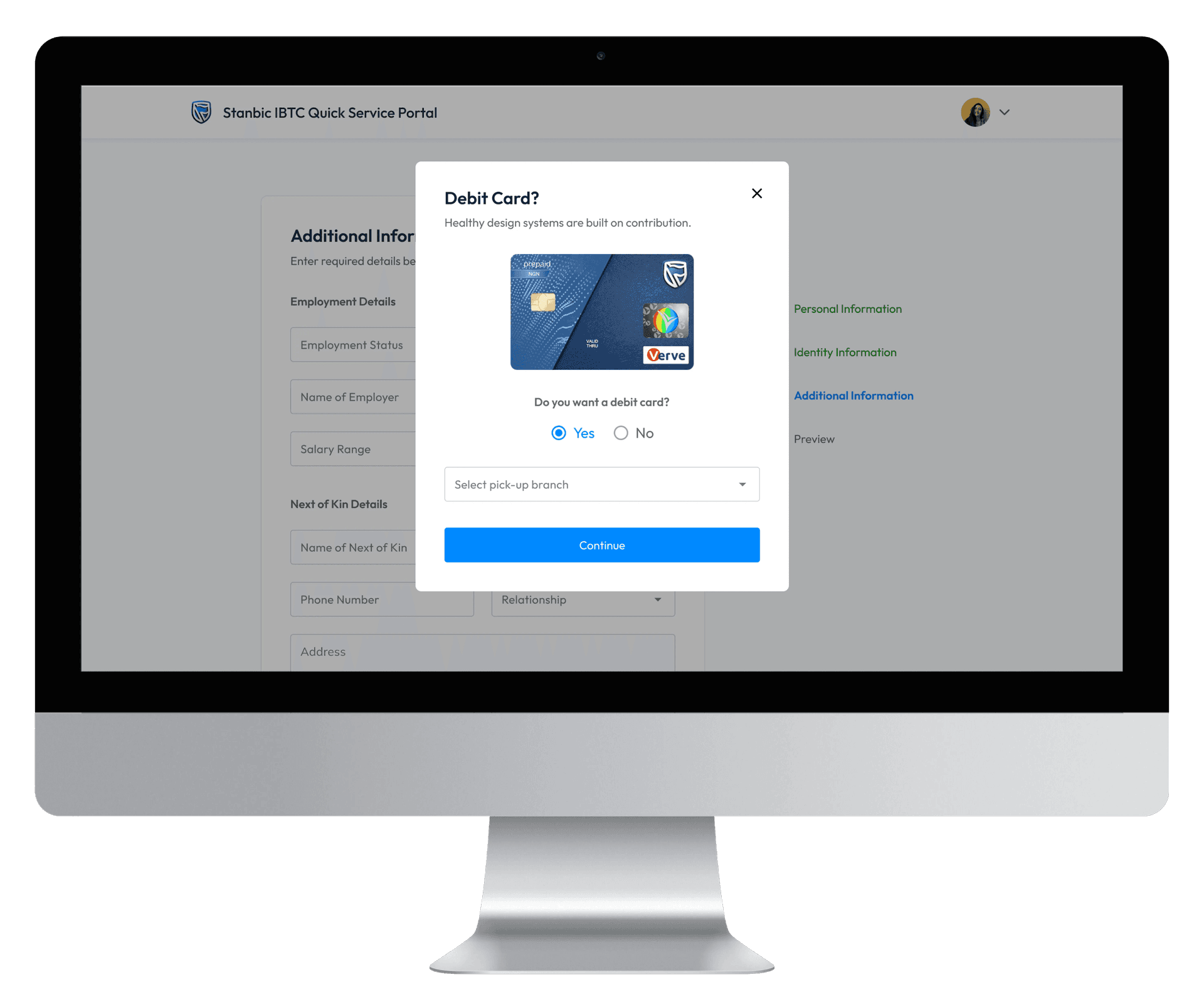
In the course of applying, just before previewing the inputted data for validation, the system checks if there’s an active debit card attached to the account. If there isn’t, a modal appears asking if they’d like to have a card and to select their most preferred pick-up branch. The bank should offer delivery in the nearest future.
Admin Portal
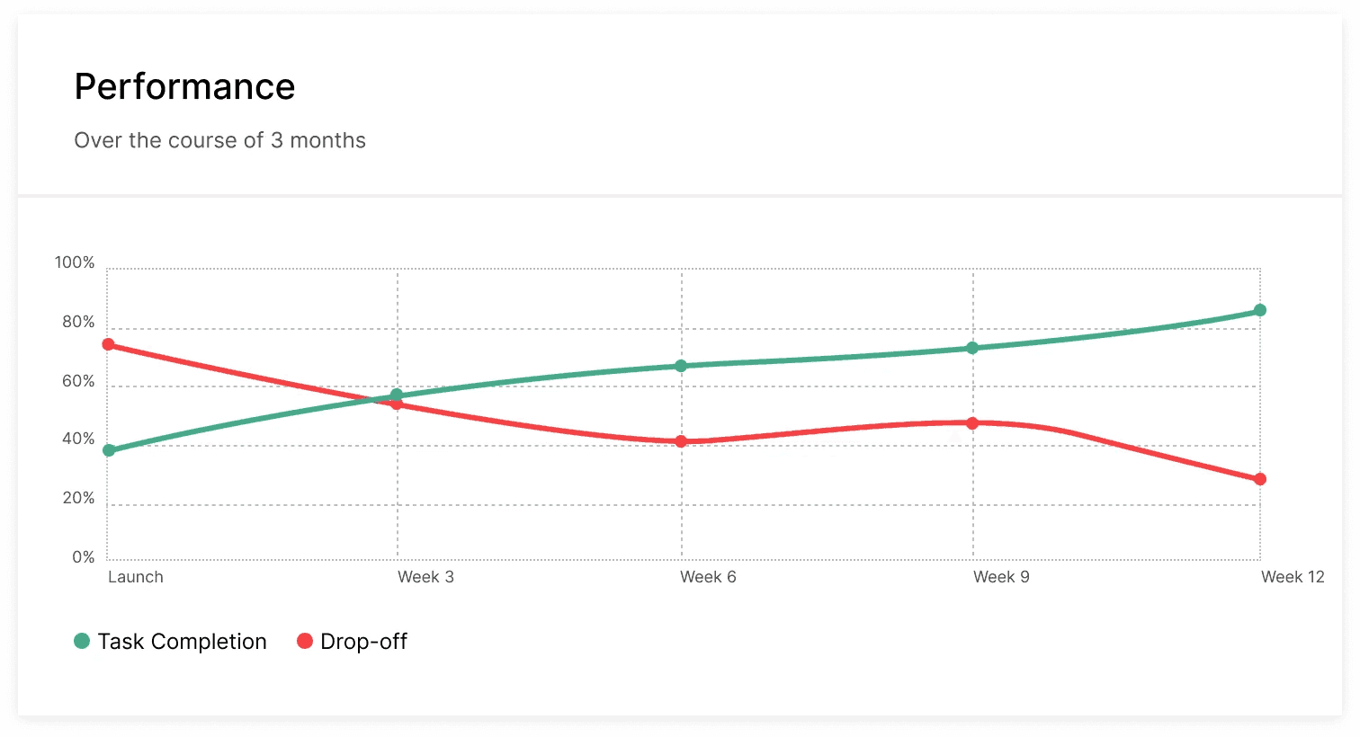
Presentation & Testing Results
What’s next?
- Designing the other flows for each user types
- Conducting adequate competitive analysis
- Designing for Mobile: Majority of our users operate on their mobile devices. This project was aimed to validate and align on processes as its primary objective, hence, the desktop-first approach.
- Testing, testing, testing and feedback
Reflections
Initially, we focused on ‘Enterprise Online’, a flow that seemed excellent but didn’t scale in value for users and business compared to other flows. For example, account upgrades were one of the most common request types. Prioritizing value to users is something I need to consider in future projects.
The power of collaboration cannot be over-emphasized
Feedback and iteration is a powerful tool all designers should continue to embrace on their journey up the ladder.
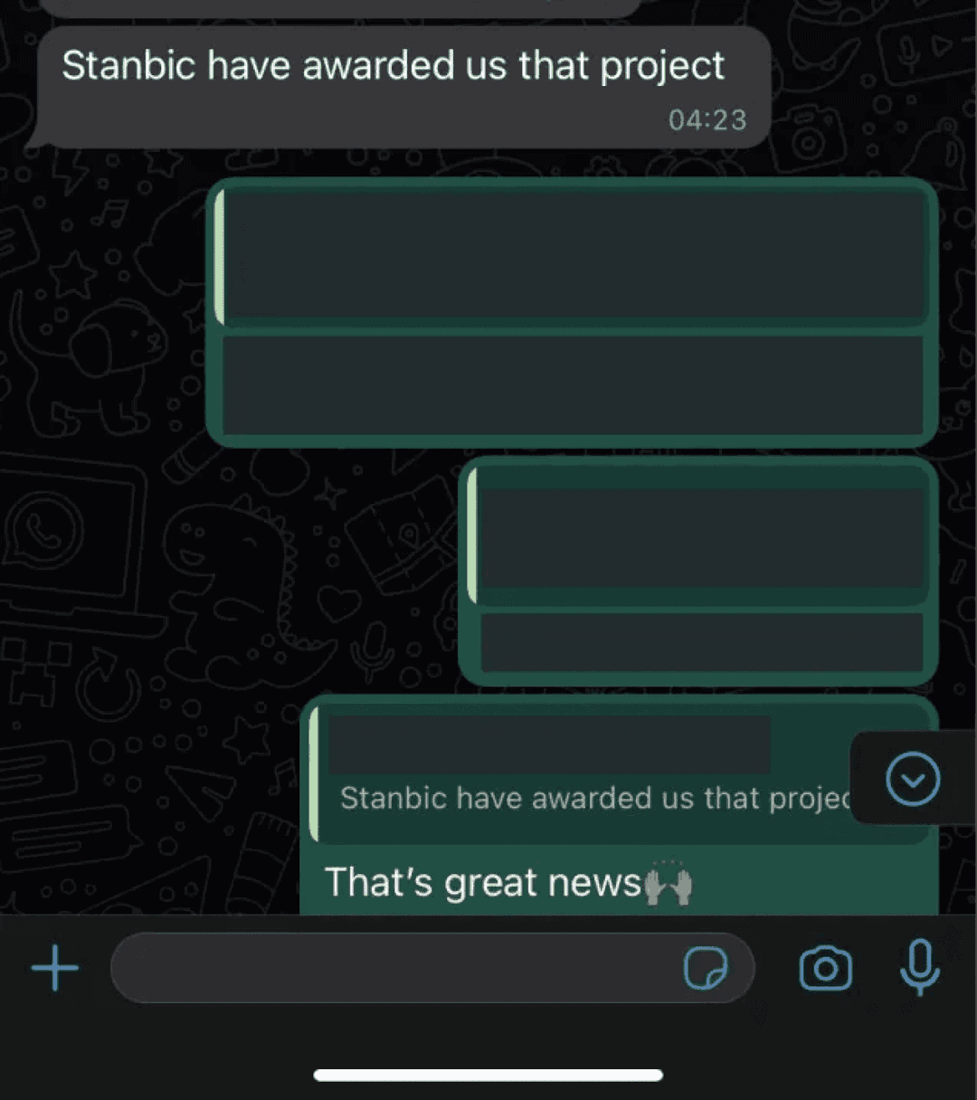
Super grateful to be a part of this project. Looking forward to what comes next.